Calls to action are underrated - 11 ideas for the perfect CTA
Whilst working in sales and marketing for over 20 years, the simpe 'call to action' or CTA is a part of most campaigns or pitch repertoire, so it is surprising that so many organisations don't make the most of the humble CTA, while others forget to include a call to action at all!
This blog was inspired after receiving an product with a warm welcoming message but sadly no call to action, missing the opportunity to help us to re-engage further. Especially as praise had been hard earned, but unfortunately the customer journey met a dead end at that point. A simple CTA would have allowed this business generate future revenue. Read our blog to find out what you could be missing. We have included real life examples and 11 useful ideas for the perfect CTA.
What is a CTA - A Definition
A Call To Action (CTA) is simply telling your reader what they need to do next? Read more, click that, visit this, contact us or buy!
A call to action (CTA) is a marketing term that refers to a statement or phrase used to encourage or persuade someone to take a particular action. CTAs are typically used in advertising or sales copy and can be found in a variety of mediums, including websites, emails, social media posts, and print materials.
A CTA can take many forms, but it often involves prompting the viewer or reader to do something specific, such as making a purchase, signing up for a newsletter, filling out a form, or contacting a business. CTAs are usually designed to be attention-grabbing and persuasive, and they may be accompanied by special offers or incentives to encourage action.
So why do people forget to include them?
Sales, marketing professionals, content writers generating communications, often concentrate their efforts on perfecting the message for the product/solution they are promoting that they end up forgetting the call to action! Without the call-to-action, CTA, you lose the opportunity for future engagement with; prospects, customers, business partners and risking them to gravitate towards a competitor, the one who did remember their 'call to action' or maybe had a stronger CTA than yours!
A.I.D.A is Marketing 101 taught at 'Marketing School'. stands for; Attention, Interest, Desire & Action so why is the 'A' for action often weak or even missed off communications?
Think of your call-to-action as a signpost or bridge to the next bit of content that will keep the audiences' attention on your business and not the competitions! CTAs are often used as the closing statement or as a button to click.
You may already use some of these; Subscribe, Get Started, Free for Free, Learn More, Join Us, Join Here. Calls to action can be used and displayed differently depending on your channel. Different CTAs work well on;
- Website
- Content, blogs, articles
- Landing pages
- Posters, flyers, invites
So find your perfect combination for your organisations' product/solution because any form of communication will benefit from using a CTA.
So who has the best calls to action? There are loads of good examples from organisations who have carefully thought about the customer journey. Equally, there are some poor examples. We have included some below that we like. I will mention my poor example at the bottom of the page. If you've ever subscribed to anything, it is probably because they had the best calls to action! Spotify, Netflix, Amazon, Hubspot are all great at CTAs, these companies rely on good calls to action and are constantly refining and improving their CTAs. Here a few good examples;
Spotify
Spotify's communications are excellent and their calls to action strong. They are clear and concise, with first time users through to existing customers under no illusion to what they need to do next. Most people can understand what they need to do next when they see a Spotify CTA and even what to expect when they get there!

BeMoto
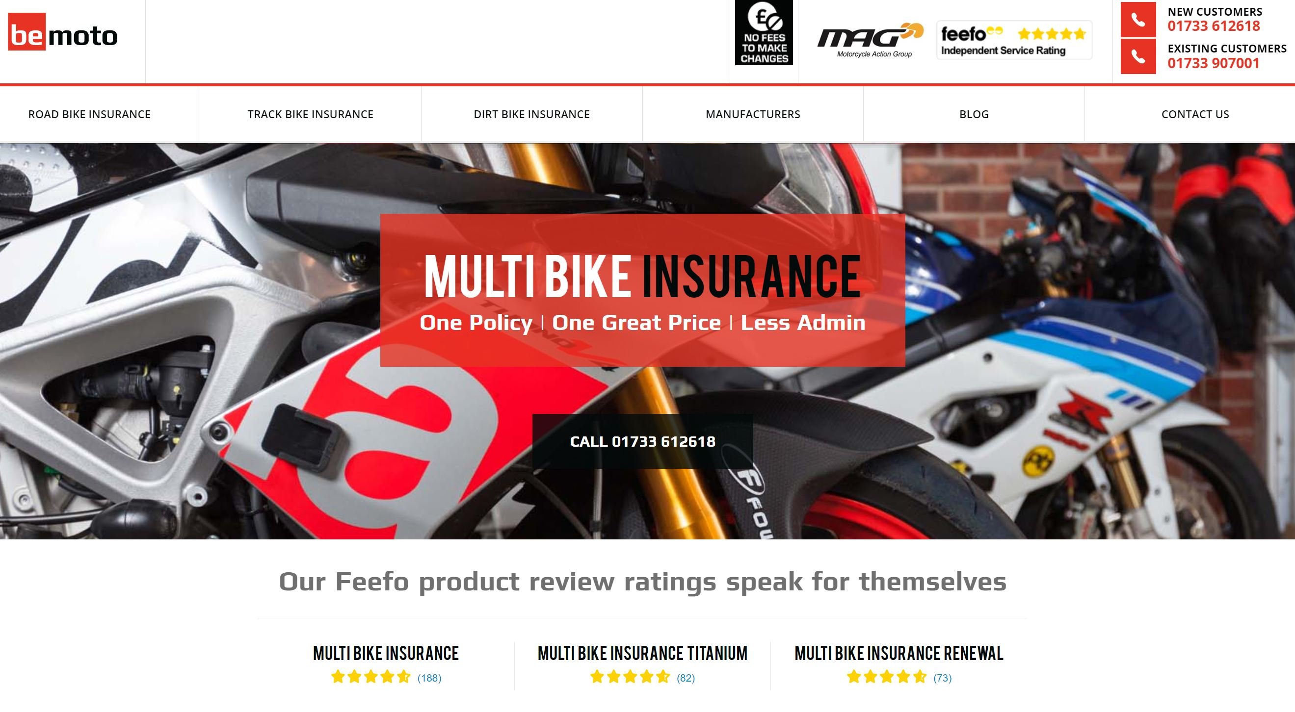
In a competitive insurance market, BeMoto are a challenger brand who understand their audience very well. As a result, calls to action on their website pages and adverts are designed to attract, retain and inspire riders. Constantly reviewing their customer user journey to keep up to date with the needs of riders, CTAs play a large part of this journey. If your interested in learning or seeing more, then contact one of our specialists, by clicking this link - They will reach out to discuss and review your current CTAs.
Pet Stop
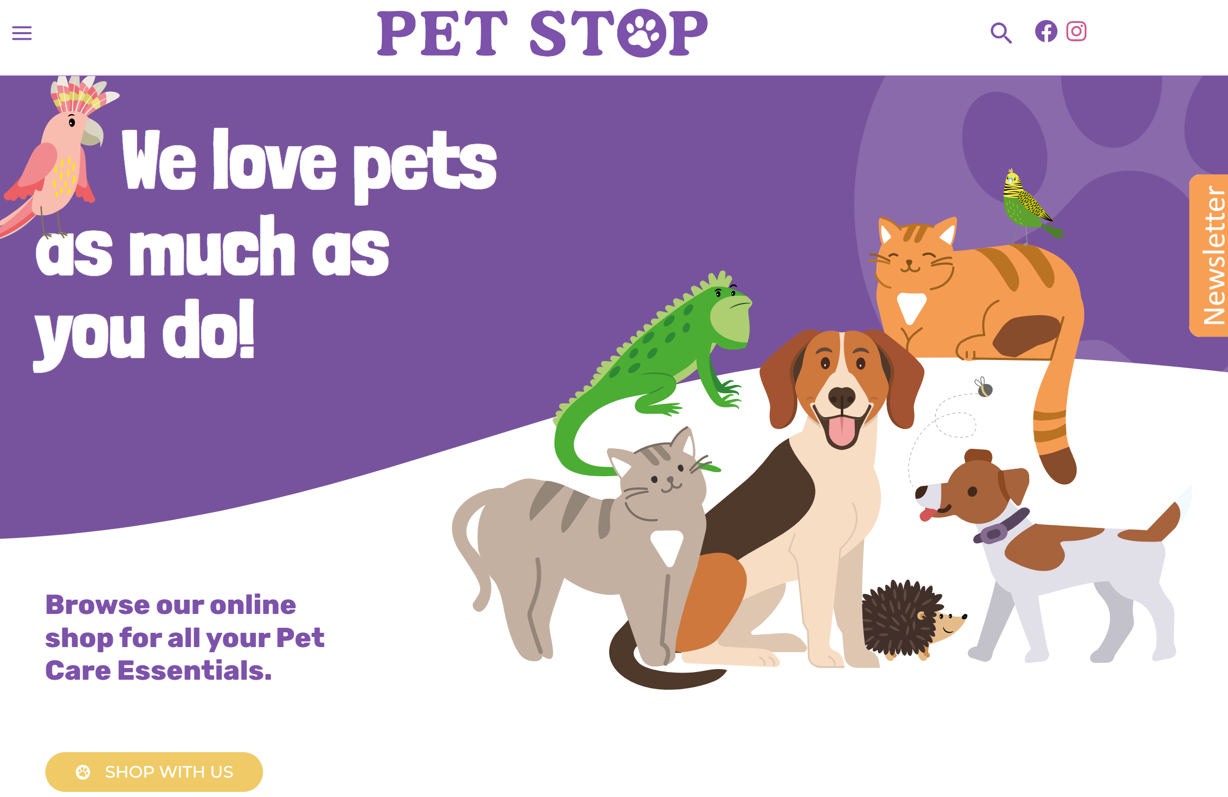
Below is another great example of a business with good calls-to-action. While Pet Stop is not a large blue chip player, they have nailed thier call to action activity! Pet Stop have taken the time to understand their target personas, what they like and don't like and create communications that can guide and engage the visitor. The website demonstrates good calls to action throughout, CTAs follow through to their social, email and other forms of communication channels a visitor prefer to use.
HubSpot
HubSpot are past masters at creating amazing content and compelling call-to-actions CTA's, they really practice what they preach!

If you would like to see more, then there are another 39 practical examples for you to view at the end of this article and help inspire you.
How to have the best CTA in the business!
So what makes a good call to action? Here are 11 points that can help.- Entice your reader using a button/lozenge. Consider colour, shape, words and positioning. Carefully consider your choice of colours, e.g. a red lozenge can be eye catching but can mean danger. Consider using a different colour lozenge to differentiate from other the other buttons you have. Remember, colours work better in some geographies than others, so do your research. Need help, then speak with one of our specialists.
-
Clickable - Ensure your calls to action on website or emails are clickable and that the destination is somewhere relevant. CTAs can open up a new windows on a visitor desktop, plus it is always good that they can get back to the page they have left as not to confuse the visitor experience. Make sure your calls to actions when using links, buttons are actually connected. Sounds obvious, but many things can happen resulting in dead links or going to the wrong page or the destination not related to the CTA or even out of date.
-
Using software tools like HubSpot make this easy to set up, insert and track CTA usage. The clicks can be tracked and you can see what are the most effective calls to action within different channels or situations. We find that systems like HubSpot are good at keeping an eye on redundant CTAs because they can be checked in one place as part of your regular housekeeping. If you would like to learn more follow this link here.
-
A picture works wonders to peak their interest. You can now create clickable pictures including calls to action.
-
Create a sense of urgency! People reading your blog or articles aren't necessarily coming back to read it again, so make it count, get them to follow the next asset and keep your brand in their eyeline.
-
Keep it short, make it clear, direct and as an order. No ambiguity or apologies like "please can you" or "Why not subscribe...", instead use terms like; Subscribe, Find Out, Trial and many others.
-
Make it compelling, why should someone click! Maybe it is a a better offer, more help, a discount, the fear of missing out (FOMO). Give the reader reasons to take action; save money, get better, learn something...you get the idea.
-
Be Trustworthy - Ensure your 'Call To Action' looks and sounds professional and trustworthy. In a world of hackers and malware, you want to ensure your links and content is safe for readers to consume, and downloadable links aren't going to mislead readers. Including official logos or telling people what they will find once they click are ways in which to build trust.
-
Positioning. People put CTAs in all sorts of places, at the beginning, middle or end. A good piece of content should explain, educate, inform and after reading and finding the content interesting or useful than you hit the reader with some compelling next steps. While your CTA in a blog or article is the perfect next action, many are now including CTAs half-way down the page.
-
Too many CTAs! Using too many conflicting CTAs causes confusion, the reader is not clear which direction they might be heading. Organisations need to be clear with their journey and avoid your audience spiralling off into different directions.
-
CTA's can come in different forms, simple words but also buttons, links even QR codes! While QR codes are useful clever tools, not everyone knows how or wants to use one. Try not to mix too many different calls to action on a communication.
- Finally, be prepared to test your calls to action by A/B Split testing, trying different action words, colours shapes, offers, positions. Try to think like your target reader and imagine yourself reading it for the first time.
Back to my real life example!
To recap, a Call to actions (CTAs) are statements or instructions designed to prompt an immediate response or action from the viewer or reader. They are usually found at the end of a piece of content, such as a blog post, webpage, or email, and are intended to encourage the reader to take a specific action, such as making a purchase, filling out a form, or subscribing to a newsletter. Increasingly calls-to-action are used mid communication because people's time is often limited. Effective CTAs are clear, concise, and compelling, and use action-oriented language to create a sense of urgency and motivate the user to take the desired action.
In my real life example discussed at the beginning of this article, which unfortunately is all too common, they missed the opportunity for any cross-sell/upsell. The company could have sought a positive referral to reassure other prospects looking to make a purchase.
Hey, where's 'your' CTA?
Ironically, we cannot preach to you about including 'calls to action' without offering you our own. Share with us some of your best calls to action you have experienced or seen, and we'll post the best and worst ones as part of this blog. Or if you would like us to send you some CTA Templates for free! Then you can email us by following the link below. We will then send you another 39 CTA examples!
Subscribers also read in the series:
Secret Source have over 22 years experience in global marketing leadership positions. We share our knowledge over via our blog, social channels or workshops. So make sure to subscribe for the latest information or simply follow your preferred social channel below.
How much does it cost to design a new website?
Written by Nick Carlson
Nicholas Carlson is a seasoned marketeer with over 25 years of experience driving impactful strategies across a wide range of industries. With a specialism in SaaS, Technology and Professional Services type organisations. As part of the team at Secret Source, he brings deep insight into the evolving landscape of marketing. Nicholas is passionate about partnering with marketing, sales, and business leaders to enhance marketing delivery and fuel sustainable business growth.


